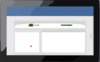
Cart Not logged in Log In Register Forgot Password Resend Validation E-mail Products WPF Controls WinRT Controls Silverlight Controls WinForms Controls ASP.NET Controls Code Writer App Icons Download Evaluations Freeware Online Demos Purchase Shopping Cart Price Lists Sales FAQ Support My Account Support Tickets Knowledge Base Consulting Services Community Blog Twitter Page Discussion Forums Polls WPFpedia Company About Us Contact Us Policies Our Customers Testimonials News Room Media Kit Careers for WPF A complete docking tool window and multiple document interface solution Online Demo Download Buy Now Docking Windows Learn More Product Overview Docking Windows Multiple Document Interface Dock Sites Latest Release Supported Environments Expression Blend Other Notes Source Code Available Bundled in WPF Studio Bundled in WPF Essentials Resources WPF Blog Entries Discussion Forums More WPF Controls Additional Benefits Thorough Documentation Help topics cover all controls and product features in great detail. Numerous Samples Many full-source demos and QuickStarts are included. Designer Functionality Configure the product using Visual Studio and Expression Blend designer enhancements. Rock Solid Code All pre-obfuscated code is scanned by the VS Code Analysis tool, and warnings resolved. Two types docking windows are supported, called document and tool windows, each with their own purpose. There are numerous features and options available so you can customize everything to fits your needs. Tool Windows Tool windows can host any WPF content and can be docked, floated, auto-hidden, or moved to an optional MDI area. They can be dragged to new locations and attached to each other to form tab groups. Complex hierarchies can be created and each control in the hierarchy has the ability to be resized via a splitter. Auto-Hidden A tab group of tool windows that is docked in the main dock site can be unpinned to enter an auto-hide state. When in this state, tabs for each tool window appears on the outer edges of the dock site. Two grouped tool windows docked (left) and auto-hidden (right) As the mouse moves over a tab, smooth animation is used to bring the related tool window content into view. When the mouse and focus leave the tool window, it uses animation to slide back into place with only the tab visible again. Document Windows Document windows can host any WPF content and are typically displayed in the MDI area, but can also be floated. They are intended to have a shorter lifespan, only while open in the UI. There are some additional features for displaying filenames and read-only states. Prism/MVVM Support Both document and tool windows can be specified explicitly or automatically generated by binding to a list of custom objects, such as view models. You can even explicity define some windows, while other are dynamically created. A free open-source extension is available that makes it easy to integrate into Prism applications as well. Dock Guides When dragging windows around, dock guides are displayed to indicate the valid drop locations. A preview of where the window will be placed is shown when the mouse is hovered of a single dock guide. This makes it easy for end-users to know where a given window can be placed. Each window or group of windows can be customized to allow or disallow certain drop targets. The Control key can be used to prevent the dock guides from being displayed. Again, this makes it easy for end-users to customize the UI to fit their needs. Interop Content We've worked hard to provide the best support for Interop content around, which includes our auto-hide flyouts. Switchers Switchers appear when pressing keys like Ctrl+Tab and allow you to quickly navigate to an open docking window via the keyboard. Previews of the docking window contents are available as you make your selection. The standard switcher used for quickly jumping between windows Animated Transitions and Effects Various animated transitions and effects are used throughout the product. When clicking between tool window tabs, you can assign any animated transition that is found in our Shared Library. We built a special transition that scrolls content left, when selecting a tab to the right, and vice versa. It makes for a really great visual effect. When causing auto-hide tool windows to fly out or back in, animations are used to scale, stretch, and/or fade the content. Hosted rafting windows have subtle animations used for fading out after inactivity. Products WPF Controls WinRT Controls Silverlight Controls WinForms Controls ASP.NET Controls Code Writer App Icons Download Evaluations Freeware Online Demos Purchase Shopping Cart Price Lists Sales FAQ Support My Account Support Tickets Knowledge Base Consulting Services Community Blog Twitter Page Discussion Forums Polls WPFpedia Company About Us Our Customers Testimonials News Room Media Kit Careers Contact Us return false;
Clker.com is owned by Rolera LLC, 2270 Route 30, Oswego, IL 60543 support\at\clker\dot\com


Comments